What Is Responsive Web Design?
BACK TO BLOGSWhat is Responsive Web Design?
According to new statistics from StatCounter, in October last year internet usage on mobile devices exceeded desktop, with 81.3% of the share compare to desktop’s 18.7%.
For this reason it is now more important than ever that your website not only works on a mobile device, but provides a great user experience.
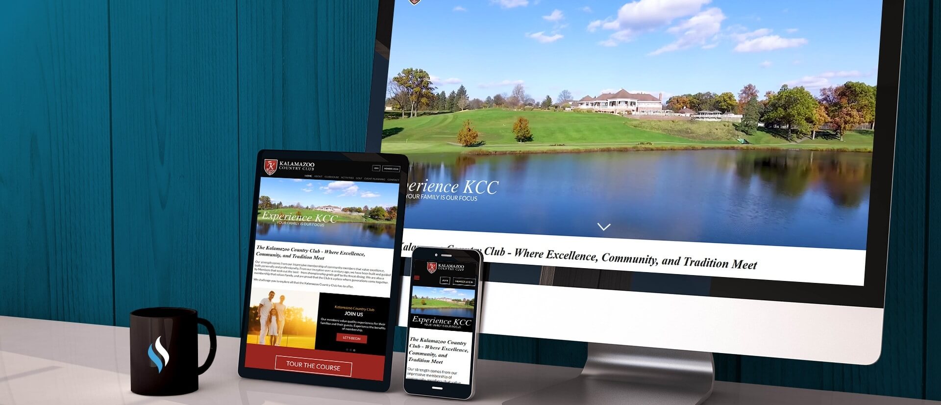
Responsive web design is the method of building a website that provides great user experience on all device types and sizes. It allows you to build a design that responds or adapts to the device that it is viewed on without having to build an entirely separate website.
Developers use percentages and other styling properties to force components on the page to resize and reposition depending on the size of the screen.
Endless Resolutions
When the internet was first established and developers started building websites, most users had very similar sized screens, so they didn’t need to worry about what their websites would look like on other devices – it would look the same.
Now, screen sizes stretch from the tiny iPhone 5 at 320px wide to TVs at 2560px wide, and whilst your target audience might not quite hit these extremes, there is a vast array of sizes in the middle.
Right now, the most common larger resolution sizes are 1366px by 768px for laptop and 1920px by 1080px for desktop monitors. The most common smaller sizes are 360px by 640px and 375px by 667px. And that’s even counting tablets, consoles and TVs! It would be impossible to build perfect looking designs for every size of device available, so we use responsive web design to cover all bases.
Mobile First
The ‘Mobile First’ movement made great strides in 2016 and will be more common throughout 2017. Instead of starting by designing your site for desktop and working your way down to mobile, the ‘Mobile First’ method starts with the small size and works upwards.
This may feel backward as the industry is so used to designing for larger screens, but if you think about it, why wouldn’t you start designing for your largest user base?
Designing for mobile can also be the trickiest – there isn’t a lot of space to work with and you don’t want users to scroll forever. The ‘Mobile First’ approach helps you to decide what are the most important features of the page that need to be included, allowing for a better user experience.
To Display or Not To Display
If you’ve started with the ‘Mobile First’ approach, as you step up from the smaller mobile sizes to the tablet and desktop sizes, you’ll see that you don’t have enough content to fill the screen, and the design principles used for mobile might look strange and out of place on desktop. At this point, you need to start changing styles, adding imagery and even complete new components that only display on desktop and tablet.
If you’ve started with desktop and are moving downwards, you will probably need to hide certain components from the page, and well as changing styles and positions.
For example, it might work to have the contact form on your website underneath some supporting content on desktop, but how far are your users going to have to scroll to reach it on a mobile? It might be sensible to hide the supporting content on mobile, or to move it beneath the contact form.
Touch or click
When building a responsive website it’s important to think about not just how your design looks on a mobile, but how a user interacts with it.
On a desktop, users have precision when interacting with your site using a mouse. Buttons and links can be smaller as users can easily click them. On a mobile however, users have to touch rather than click, and if you have larger hands, clicking a tiny little icon can become tricky – especially if you’ve grouped a few icons together.
Try to make any interactions a user has with the page clear and easy to touch, not just click.
If you’re interested in finding out how GForce Web Design can help you with your new responsive web design build, we’d love to hear from you.
Discover our web design agency and or get in touch 0121 661 6595 with our solutions team directly.


